// About / Heritage page — timeline + philosophy + press wall.

function PageAbout({ navigate }) {
  return (
    <main className="fade-enter">
      <AboutHero />
      <Philosophy />
      <Timeline />
      <ModulesBand />
      <ClosingCTA navigate={navigate} />
    </main>
  );
}

function AboutHero() {
  return (
    <section style={{ position: 'relative', minHeight: 520, overflow: 'hidden' }}>
      <img src="assets/hero-about-banner.png" alt="" style={{ position: 'absolute', inset: 0, width: '100%', height: '100%', objectFit: 'cover' }} />
      <div style={{ position: 'absolute', inset: 0, background: 'linear-gradient(180deg, rgba(31,27,23,0.4) 0%, rgba(31,27,23,0.85) 100%)' }} />
      <div className="container container--wide" style={{ position: 'relative', padding: '140px var(--gutter) 80px', color: 'var(--paper)' }}>
        <div style={{ maxWidth: 760 }}>
          <div className="eyebrow" style={{ color: 'var(--saffron)' }}>Our story</div>
          <h1 style={{ fontSize: 'clamp(48px, 7vw, 92px)', lineHeight: 1, marginTop: 18, color: 'var(--paper)' }}>
            One Lebanese grill.<br/>
            <span style={{ color: 'var(--saffron)', fontStyle: 'italic' }}>Forty-nine years.</span><br/>
            Same fire.
          </h1>
        </div>
      </div>
    </section>
  );
}

function Philosophy() {
  return (
    <section className="section">
      <div className="container container--wide">
        <div style={{ display: 'grid', gridTemplateColumns: '1fr 1.4fr', gap: 80, alignItems: 'start' }} className="phil-grid">
          <div>
            <div className="eyebrow">Back to basics</div>
            <h2 className="section-title">The recipe is the recipe.</h2>
          </div>
          <div style={{ fontSize: 18, lineHeight: 1.7, color: 'var(--ink-2)', display: 'flex', flexDirection: 'column', gap: 18 }}>
            <p>
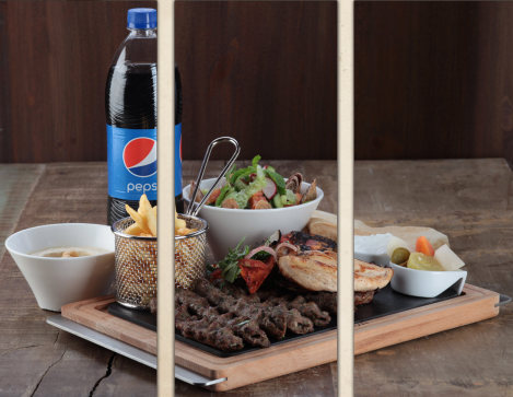
              In 1977 we opened a single Lebanese grill on the Abu Dhabi Corniche. We made hummus the way
              Beirut taught us. We baked Lebanese pita on site. We grilled chicken and lamb over charcoal,
              never gas. We portioned food the way mothers do — generously.
            </p>
            <p>
              In 2002, DAMAC Properties acquired the brand and asked one question: <em>what makes it work?</em>
              The answer was simple. Don't change the recipe. Don't shrink the portion. Don't move off the charcoal.
            </p>
            <p>
              Forty-nine years later, we have <strong>twelve outlets</strong> across Dubai and Abu Dhabi.
              <strong> 1,921 Talabat ratings</strong> have settled at <strong>4.7 stars</strong>. Time Out called us
              "the ambassador of the Dubai shawarma." We haven't changed the recipe.
            </p>
          </div>
        </div>
      </div>
      <style>{`@media (max-width: 820px) { .phil-grid { grid-template-columns: 1fr !important; } }`}</style>
    </section>
  );
}

function Timeline() {
  return (
    <section className="section section--charcoal">
      <div className="container container--wide">
        <div className="eyebrow" style={{ color: 'var(--saffron)' }}>The road</div>
        <h2 className="section-title" style={{ color: 'var(--paper)' }}>From a single Corniche grill to twelve.</h2>

        <div style={{ marginTop: 64, position: 'relative' }}>
          <div style={{ position: 'absolute', left: 88, top: 0, bottom: 0, width: 2, background: 'rgba(245,235,220,0.12)' }} className="timeline-line" />
          {window.TIMELINE.map((t, i) => (
            <div key={t.year} style={{ display: 'flex', gap: 32, marginBottom: 48, position: 'relative' }} className="timeline-row">
              <div className="serif" style={{ fontSize: 44, fontWeight: 600, color: 'var(--saffron)', width: 120, flexShrink: 0, lineHeight: 1 }}>
                {t.year}
              </div>
              <div style={{
                position: 'absolute', left: 80, top: 14,
                width: 18, height: 18, borderRadius: '50%',
                background: 'var(--terracotta)', border: '3px solid var(--charcoal)',
                boxShadow: '0 0 0 1px var(--terracotta)',
              }} />
              <div style={{ flex: 1, paddingLeft: 32, paddingTop: 6 }}>
                <div className="serif" style={{ fontSize: 26, color: 'var(--paper)', fontWeight: 600 }}>{t.headline}</div>
                <p style={{ fontSize: 15, color: 'rgba(245,235,220,0.7)', marginTop: 8, maxWidth: '60ch', lineHeight: 1.6 }}>
                  {t.body}
                </p>
              </div>
            </div>
          ))}
        </div>

        <div style={{ display: 'grid', gridTemplateColumns: 'repeat(3, 1fr)', gap: 16, marginTop: 64 }} className="quote-grid">
          {window.PRESS.slice(0, 3).map((p, i) => (
            <div key={i} style={{ padding: 24, background: 'rgba(245,235,220,0.06)', borderRadius: 'var(--radius)', border: '1px solid rgba(245,235,220,0.1)' }}>
              <div className="serif" style={{ fontSize: 18, color: 'var(--paper)', lineHeight: 1.4, fontStyle: 'italic' }}>"{p.quote}"</div>
              <div className="mono" style={{ marginTop: 16, fontSize: 10, letterSpacing: '0.16em', color: 'var(--saffron)' }}>— {p.source}, {p.date}</div>
            </div>
          ))}
        </div>
      </div>
      <style>{`
        @media (max-width: 720px) {
          .timeline-line { left: 36px !important; }
          .timeline-row > div:first-child { width: 60px !important; font-size: 28px !important; }
          .timeline-row { gap: 16px !important; }
          .quote-grid { grid-template-columns: 1fr !important; }
        }
      `}</style>
    </section>
  );
}

function ModulesBand() {
  const modules = [
    { name: 'The Restaurant', size: '3,000 – 4,500 sq ft', desc: 'Full-service dine-in with charcoal grill in view and external terrace where possible.', img: 'interior-1' },
    { name: 'The Café', size: '1,500 – 2,500 sq ft', desc: 'Lighter footprint, take-away counter, family seating. Coffee and saj.', img: 'interior-3' },
    { name: 'Food-court Unit', size: '700 – 1,200 sq ft', desc: 'High-volume malls and free zones. Same recipe, faster service.', img: 'interior-5' },
  ];
  return (
    <section className="section">
      <div className="container container--wide">
        <div className="eyebrow">Three formats</div>
        <h2 className="section-title">One recipe, three rooms.</h2>
        <p className="lede" style={{ marginTop: 14 }}>
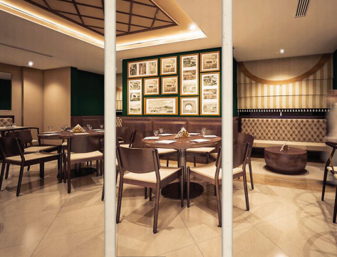
          We operate the brand in three formats. Every format runs the same charcoal grill,
          the same mezze line, the same pita.
        </p>
        <div style={{ display: 'grid', gridTemplateColumns: 'repeat(3, 1fr)', gap: 20, marginTop: 48 }} className="modules-grid">
          {modules.map(m => (
            <article key={m.name} style={{ background: 'var(--paper)', border: '1px solid var(--line)', borderRadius: 'var(--radius)', overflow: 'hidden' }}>
              <div style={{ aspectRatio: '4/3', overflow: 'hidden' }}>
                <img src={`assets/${m.img}.jpg`} alt="" style={{ width: '100%', height: '100%', objectFit: 'cover' }} />
              </div>
              <div style={{ padding: 24 }}>
                <div className="mono" style={{ fontSize: 10, letterSpacing: '0.14em', color: 'var(--terracotta)' }}>{m.size}</div>
                <h3 className="serif" style={{ fontSize: 22, fontWeight: 600, marginTop: 8 }}>{m.name}</h3>
                <p style={{ fontSize: 13, color: 'var(--ink-2)', marginTop: 8, lineHeight: 1.5 }}>{m.desc}</p>
              </div>
            </article>
          ))}
        </div>
      </div>
      <style>{`@media (max-width: 820px) { .modules-grid { grid-template-columns: 1fr !important; } }`}</style>
    </section>
  );
}

function ClosingCTA({ navigate }) {
  return (
    <section className="section" style={{ background: 'var(--cream)' }}>
      <div className="container container--wide">
        <div style={{
          padding: '64px 56px',
          background: 'var(--paper)',
          border: '1px solid var(--line)',
          borderRadius: 'var(--radius-lg)',
          display: 'grid',
          gridTemplateColumns: '1.4fr 1fr',
          gap: 64,
          alignItems: 'center',
        }} className="closing-grid">
          <div>
            <div className="eyebrow">Come hungry</div>
            <h2 className="section-title">The fire's already on.</h2>
            <p className="lede" style={{ marginTop: 16 }}>
              Twelve outlets, one recipe, charcoal-hot every day from 9am.
              Walk in, call ahead, or open the app — we'll have the hummus ready.
            </p>
            <div style={{ display: 'flex', gap: 12, marginTop: 28, flexWrap: 'wrap' }}>
              <button className="btn btn--primary" onClick={() => navigate('branches')}>Find a branch</button>
              <button className="btn btn--ghost" onClick={() => navigate('menu')}>Read the menu</button>
            </div>
          </div>
          <div style={{ position: 'relative' }}>
            <img src="assets/mixed-grill-1.png" alt="" style={{ width: '100%', borderRadius: 'var(--radius)' }} />
          </div>
        </div>
      </div>
      <style>{`@media (max-width: 820px) { .closing-grid { grid-template-columns: 1fr !important; padding: 40px !important; } }`}</style>
    </section>
  );
}

window.PageAbout = PageAbout;
